
PROJECTIVE
Branding et website
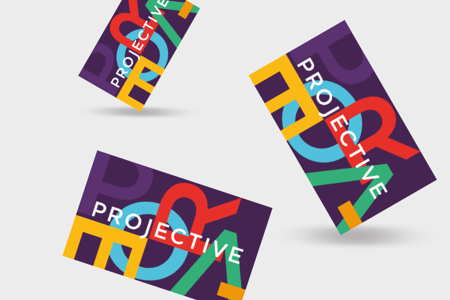
Née en co-création, l’identité Projective insuffle les valeurs de l’équipe ; partage, innovation, esprit d’équipe, enthousiasme, énergie. Projective accompagne ses clients dans les projets de transformation des espaces de travail. Projective fait de ses clients les architectes de leur transformation.
Projective, c'est un accélérateur d’innovation.
Born through co-creation, Projective identity instills the team's values: sharing, innovation, team spirit, enthusiasm and energy. Projective supports you in your workspace transformation projects. Projective makes you the architects of your transformation, in your workspaces.
Projective, an innovation accelerator.
www.projectivearchitecture.fr
WPO
Publication digitale
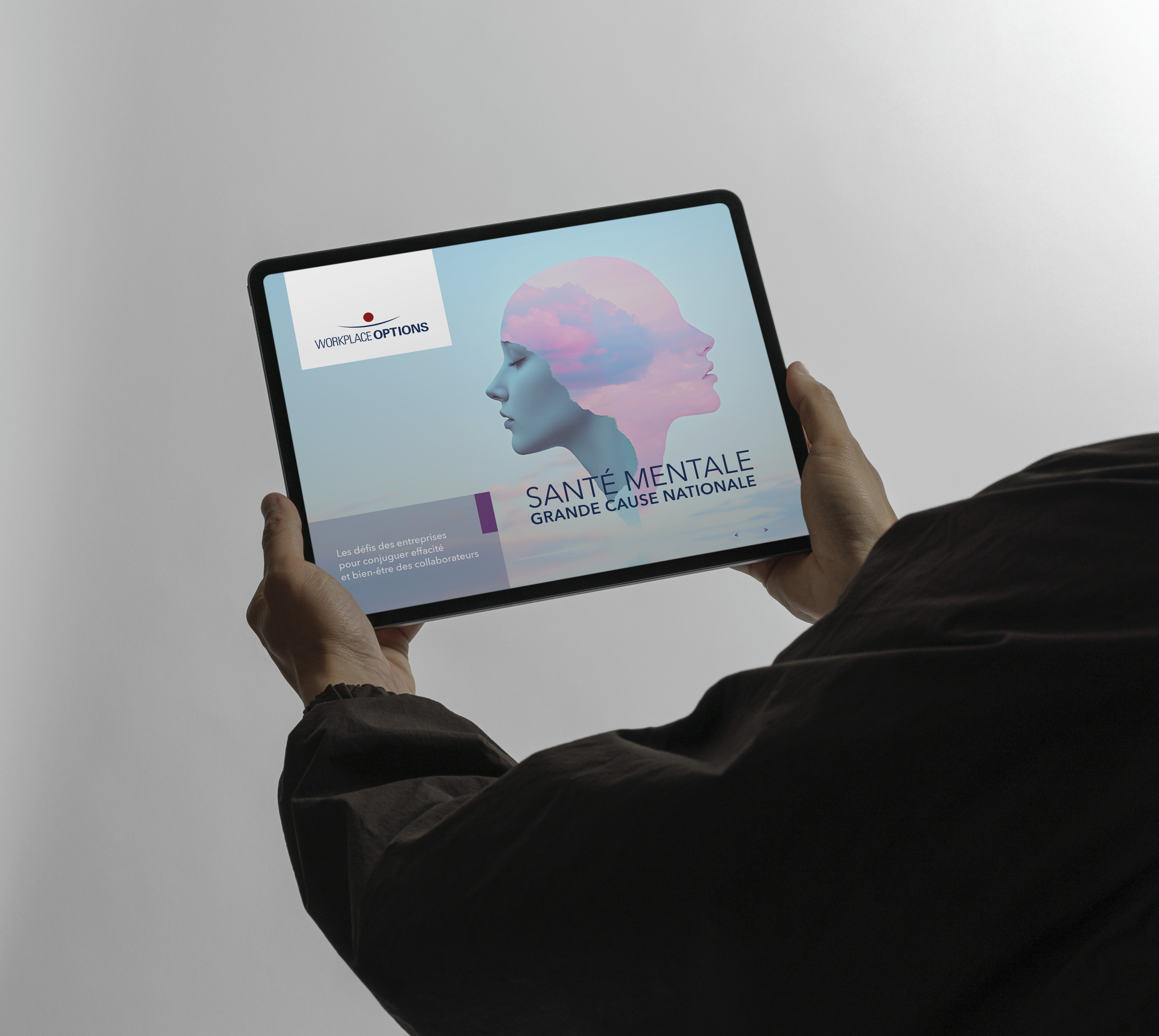
Creation digitale animée pour une publication sur la santé mentale.
Creation of a digital publication on mental health, a major national cause. WPO supports companies and employees on mental health issues and returning to work.

CRIP
Branding et outils de communication
Pour le CRIP, nous avons conçu une identité pensée pour durer : simple, lisible et adaptable à l’ensemble des supports. Déclinée en print comme en digital, elle s’appuie sur une écriture claire, facile à s’approprier et à décoder. Les outils de communication gagnent en efficacité, sans jamais perdre en cohérence. Une palette de couleurs étendue et un système d’illustrations permettent d’apporter à chaque publication une tonalité propre, à la fois vivante et reconnaissable.
For CRIP, we designed an identity built to last: simple, legible, and adaptable across all media. Applied in both print and digital, it is based on a clear visual language that is easy to use and understand. Communication tools become more effective without ever losing coherence. An extended color palette and an illustration system bring a distinct tone to each publication—both vibrant and recognizable.

SWISS STUDENT CARE
Branding et interface UX
Branding, création de l'identité et de la brochure digitale d'un produit d'assurance destiné aux étudiants étrangers arrivant en Suisse. L'identité s'inscrit dans les codes graphiques de la maison mère, l'entreprise Swiss Risk & Care.
Branding, graphic identity and digital brochure for an insurance product aimed at international students arriving in Switzerland. The identity aligns with the graphic codes of the parent company, Swiss Risk & Care.
FONDATION JEAN-JAURES
Publications
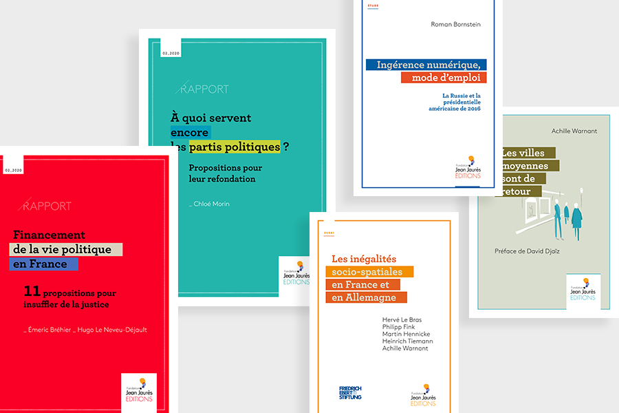
Pour la Fondation Jean-Jaurès Éditions, nous avons conçu une gamme de publications pensée pour une diffusion fluide, en intégrant dès l’origine les contraintes de l’impression numérique. Le dispositif repose sur une écriture graphique claire, colorée et facilement déclinable, adaptée à des formats variés et à une production simple, rapide et fiable. Chaque choix — mise en page, couleurs, hiérarchisation — est optimisé pour garantir lisibilité et constance à l’impression. Nous avons également structuré les contenus selon différents niveaux de lecture : une approche immédiate pour saisir l’essentiel, complétée par des développements plus détaillés pour approfondir. Cette organisation permet à chaque lecteur de trouver rapidement l’information, selon son temps et son besoin. L’ensemble s’inscrit dans la charte de l’identité Fondation Jean-Jaurès, renforçant la cohérence et la reconnaissance des publications. Une édition à la fois accessible, structurée et exigeante.
For Fondation Jean-Jaurès Éditions, we designed a range of publications conceived for smooth distribution, integrating the constraints of digital printing from the outset. The system is based on a clear, colorful, and easily adaptable graphic language, suited to varied formats and simple, fast, and reliable production. Every choice—layout, colors, hierarchy—is optimized to ensure readability and consistency in print. We also structured the content across different levels of reading: an immediate approach to grasp the essentials, complemented by more detailed sections for deeper insight. This organization allows each reader to quickly find the information they need, depending on their time and purpose. The whole is aligned with the Fondation Jean-Jaurès identity guidelines, reinforcing the coherence and recognizability of the publications. An editorial approach that is both accessible, structured, and exacting.
ALLIANZ
Projet 'Tous orientés Clients'
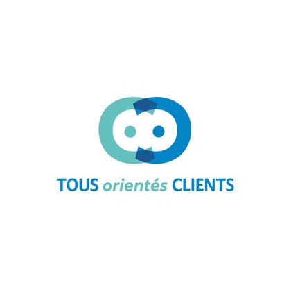
Pour Allianz, nous avons conçu une identité simple et forte et immédiatement lisible pour le programme “Tous orientés clients”.
Au cœur du dispositif : un symbole simple et universel. Deux personnes qui se tendent les bras, jusqu’à ne former qu’un seul personnage. Une métaphore visuelle claire de la collaboration, de l’engagement collectif et de l’orientation client partagée à tous les niveaux de l’entreprise.
Nous avons déployé cette identité sur l’écosystème du programme :
- Un site web et une video, pensés pour être clair, dynamique et orientés action
- Un dispositif de gamification, pour embarquer les collaborateurs, stimuler la participation et ancrer les comportements dans la durée
- Une salle de formation entièrement brandée, immersive, pour faire vivre concrètement l’expérience “Tous orientés clients”
Une identité qui ne se contente pas d’exister visuellement, elle structure, engage et diffuse une culture client tangible dans l’entreprise.
For Allianz, we designed a simple and strong identity for the “Tous orientés Clients" program.
At the heart of the concept: a simple and universal symbol. Two people reaching out to each other, until they become a single figure. A clear visual metaphor for collaboration, collective commitment, and a shared customer focus at every level of the company.
We deployed this identity across the program’s ecosystem:
A website and a video, designed to be clear, dynamic, and action-oriented
A gamification system, to engage employees, encourage participation, and embed behaviors over time
A fully branded, immersive training room, bringing the “All Customer-Oriented” experience to life
Result: an identity that doesn’t just exist visually, but that structures, engages, and spreads a tangible customer-centric culture throughout the company.